Hiya Calls:
Driving User Retention through Voicemail Optimization

The Visual Voicemail feature at Hiya wasn’t getting the traction it needed. I led a usability research sprint to uncover why and delivered insights that directly shaped feature design, copy, and adoption strategy.

Project Overview

Outcome: Increased user engagement by 24%, improved task success by 60%, and reduced support costs- demonstrating how research insights drove product growth at scale.

Team Members

Niharthi Muddada (UX Analyst and Strategist)

Kayla Ren (UX Designer)

Motolani Shenbanjo (UX Researcher)

Mentor: Ryan Adams (Principal Research Manager, Hiya)

Mentor: Chaitanya M (PM, Hiya)

Impact

+40%

Increased User Satisfaction & Retention Growth

+60%

Increased Feature Engagement & Retention

My Challenge & Goal

“Users expected voicemail to work like a messaging app but struggled to retrieve messages efficiently.”


My role as the UXR on this feature was to reconnect Voicemail with its actual users. Instead of improving it in isolation, I focused on understanding when, why, and how people used it and what they needed it to become.

EXPLORATORY RESEARCH

EXPLORATORY RESEARCH

Key findings - Pain Points

Key findings - Pain Points

Here are the final overall findings we got from this research project.

Here are the final overall findings we got from this research project.

4/5

Severity

Users struggled to retrieve old voicemails

No search/filter function forced users to manually scroll through voicemails.

4/5

Severity

Users struggled to retrieve old voicemails

No search/filter function forced users to manually scroll through voicemails.

4/5

Severity

Users struggled to retrieve old voicemails

No search/filter function forced users to manually scroll through voicemails.

4/5

Severity

Unclear "Share" button options

Users hesitated between "Share as Link" vs. "Share as File"

1/5

Severity

Unclear "Share" button options

Users hesitated between "Share as Link" vs. "Share as File"

3/5

Severity

Users couldn’t easily find deleted messages

Deleted voicemails were hidden under an unclear "Manage" tab

3/5

Severity

Users couldn’t easily find deleted messages

Deleted voicemails were hidden under an unclear "Manage" tab

3/5

Severity

Users couldn’t easily find deleted messages

Deleted voicemails were hidden under an unclear "Manage" tab

2/5

Severity

"Block Caller" vs. "Report Spam

Users mistakenly assumed blocking a number also reported it as spam

2/5

Severity

"Block Caller" vs. "Report Spam

Users mistakenly assumed blocking a number also reported it as spam

2/5

Severity

Limited response options for calling back

Only "Call Back" was available, limiting user flexibility

2/5

Severity

Limited response options for calling back

Only "Call Back" was available, limiting user flexibility

PROCESS

PROCESS

Why users weren’t engaging? - and how we turned that around

Why users weren’t engaging? - and how we turned that around

The study began with exploratory research to understand user expectations, app functionality, and existing usability challenges. This research helped refine the key research questions that guided usability testing.

The study began with exploratory research to understand user expectations, app functionality, and existing usability challenges. This research helped refine the key research questions that guided usability testing.

My goal is to move beyond usability and understand how voicemail fits into people’s real habits, not just how it functions.

My goal is to move beyond usability and understand how voicemail fits into people’s real habits, not just how it functions.

CHALLENGE

“To ensure the new Voice Mail feature offers Android users a seamless onboarding experience and‬ can be easily enabled, and interacted with.‬”

CHALLENGE

“To ensure the new Voice Mail feature offers Android users a seamless onboarding experience and‬ can be easily enabled, and interacted with.‬”

CHALLENGE

“To ensure the new Voice Mail feature offers Android users a seamless onboarding experience and‬ can be easily enabled, and interacted with.‬”

OUR 3 PHASE PROCESS

  • PHASE 1: Primary & Secondary Research

  • PHASE 2: Usability Testing

  • PHASE 3: Recommendations

OUR 3 PHASE PROCESS

  • PHASE 1: Primary & Secondary Research

  • PHASE 2: Usability Testing

  • PHASE 3: Recommendations

OUR 3 PHASE PROCESS

  • PHASE 1: Primary & Secondary Research

  • PHASE 2: Usability Testing

  • PHASE 3: Recommendations

Project Plan and Why 3 Phases?

Project Plan and Why 3 Phases?

To avoid making surface-level fixes, I structured the research in 3 distinct phases:

To avoid making surface-level fixes, I structured the research in 3 distinct phases:

P1: Uncover Foundation insights

Real-life scenario 1: Access an assigned message

I wanted to uncover behavioral patterns and unmet needs, so I began with Mental model mapping and competitive benchmarking to explore users' call habits and voicemail use in the wild.

P2: Evaluate

Real-life scenario 2: Access a span
message

After identifying friction points in the current app and understanding users, I tested usability to observe real-time breakdowns and validate specific redesign directions.

P3: Synthesis + Strategy

Real-life scenario 3:
Access a msg.
about dental appointment

In this final phase, I zoomed out to identify themes, triangulate with prior findings, and transform the findings into actionable design recommendations and a better product strategy.


This phased approach helped me go from

Open-ended discovery Targeted testing to find specific pain points Actionable design recommendations.


This phased approach helped me go from

Open-ended discovery Targeted testing to find specific pain points Actionable design recommendations.

PHASE - 1

PHASE - 1

Understanding Voicemail and Expectations Before We Talked to Users

Understanding Voicemail and Expectations Before We Talked to Users

To form a holistic view of both existing UX gaps and evolving user expectations around voicemail experiences. We uncovered foundational insights into how users currently interact with voicemail systems and what mental models they bring into the experience.

To form a holistic view of both existing UX gaps and evolving user expectations around voicemail experiences. We uncovered foundational insights into how users currently interact with voicemail systems and what mental models they bring into the experience.

GOAL: To understand general user behavior patterns and current needs from voicemail

GOAL: To understand general user behavior patterns and current needs from voicemail

Through conducting these Research Methods

Through conducting these Research Methods

Heuristic Evaluation

  • Reviewed Hiya’s voicemail onboarding and feature navigation to understand what the current app offering and processes

Heuristic Evaluation

  • Reviewed Hiya’s voicemail onboarding and feature navigation to understand what the current app offering and processes

Heuristic Evaluation

  • Reviewed Hiya’s voicemail onboarding and feature navigation to understand what the current app offering and processes

Competitive Benchmarking

  • Compared features across Google Voice, iOS Voicemail, and Samsung (fig 1) to benchmark user behaviour

Competitive Benchmarking

  • Compared features across Google Voice, iOS Voicemail, and Samsung (fig 1) to benchmark user behaviour

Competitive Benchmarking

  • Compared features across Google Voice, iOS Voicemail, and Samsung (fig 1) to benchmark user behaviour

Mental Model Mapping (Early-stage)

  • Mapped assumptions about voicemail usability to align test flows with user expectations (fig 2) tieing these insights with user's mental models

Mental Model Mapping (Early-stage)

  • Mapped assumptions about voicemail usability to align test flows with user expectations (fig 2) tieing these insights with user's mental models

Mental Model Mapping (Early-stage)

  • Mapped assumptions about voicemail usability to align test flows with user expectations (fig 2) tieing these insights with user's mental models

Competitive Benchmarking[Fig 1 above]

Mental Model Mapping [Fig 2 above]

Uncovered
Behavioral
insights

from Phase 1

Uncovered
Behavioral
insights

from Phase 1

  • Hiya’s current setup may confuse users, as no guided onboarding and missing cues create potential friction.

  • Competitors offer smoother flows with better visibility of features and options.

  • Users expect voicemail to behave like messaging apps, like more searchable, recoverable, and responsive.

Research Q's : Behavior and Friction

We shaped the research questions to uncover not just usability gaps, but also understand users' expectations around voicemail have changed over time. Here are main questions:

  1. How do users attempt to retrieve, manage, and recover voicemails, and where do they encounter friction?

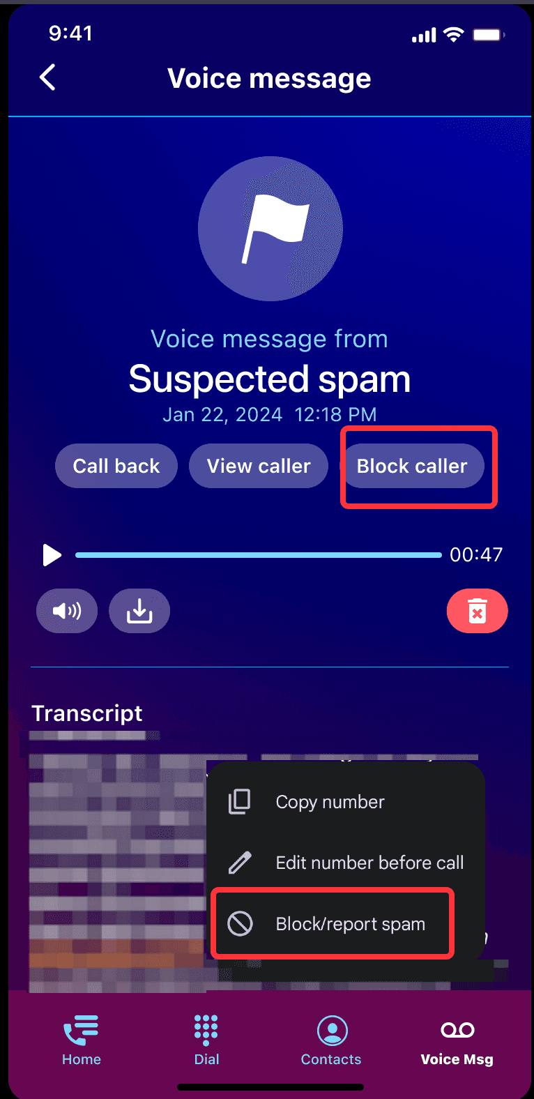
  2. How do users interpret and interact with voicemail management features, such as blocking, reporting spam, and sharing messages?

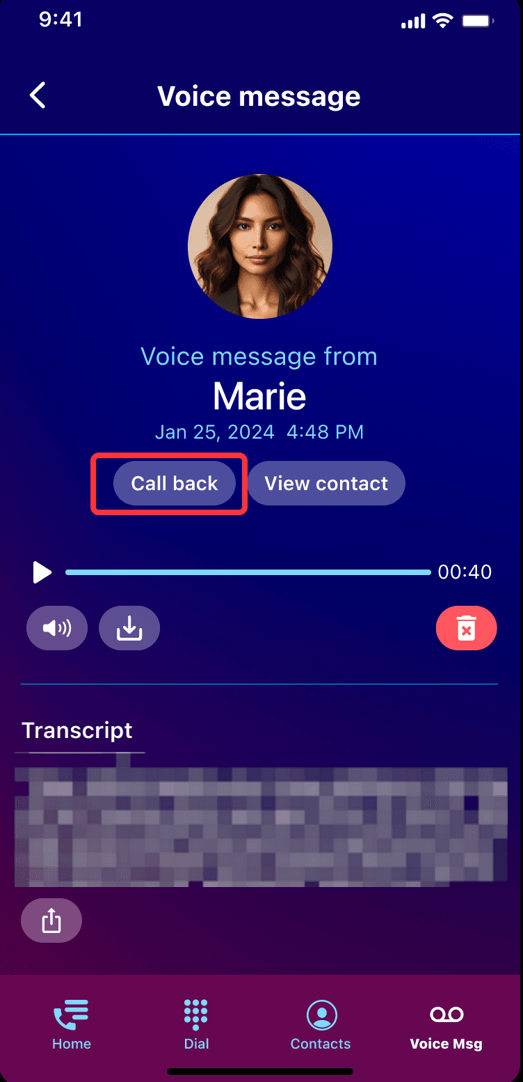
  3. What response options do users expect when interacting with voicemail messages?

PHASE - 2

PHASE - 2

Usability Testing - How We Ran the Study

Usability Testing - How We Ran the Study

Usability Testing - How We Ran the Study

After identifying key usability risks through heuristic evaluation, mental models, and competitor audits, we designed a targeted usability test to validate those insights and understand how real users interact with Hiya's Visual Voicemail feature.

After identifying key usability risks through heuristic evaluation, mental models, and competitor audits, we designed a targeted usability test to validate those insights and understand how real users interact with Hiya's Visual Voicemail feature.

After identifying key usability risks through heuristic evaluation, mental models, and competitor audits, we designed a targeted usability test to validate those insights and understand how real users interact with Hiya's Visual Voicemail feature.

Usability Testing Goal: Validating Navigation and Onboarding

  • My goal was to evaluate how well Hiya’s Visual Voicemail experience supported real user behaviors—from onboarding through message management—and to identify strategic friction points that, if addressed, could increase user satisfaction and feature engagement.

Participant recruitment

  • Android users (ages 21-30) → Representative of Hiya’s primary user base.

  • Frequent voicemail users → Ensured they had real usage habits.

  • Never used iOS Voicemail → Avoided bias from Apple’s voicemail interface.

  • Android users (ages 21-30) Representative of Hiya’s primary user base.

  • Frequent voicemail users Ensured they had real usage habits.

  • Never used iOS Voicemail To avoid bias from Apple’s voicemail interface.

Testing session design

  • Pre-study questions (10 mins)

  • Go over Scenarios & Tasks (20-30 mins): Think-aloud, Post-task questionnaire- Likert scale

  • Post-study questionnaire (10 mins): Likert scale, Open-ended questions

  • Pre-study questions (10 mins)

  • Go over Scenarios & Tasks (20-30 mins): Think-aloud, Post-task questionnaire- Likert scale.

  • Post-study questionnaire (10 mins): Likert scale, Open-ended questions

Tasks + scenario design - How we ran the study

Tasks + scenario design - How we ran the study

Tasks + scenario design - How we ran the study

We conducted moderated usability testing using real-life scenarios, encouraging participants to think aloud while completing key voicemail tasks. Their actions, quotes, and post-task ratings helped us uncover usability gaps and emotional friction points.

We conducted moderated usability testing using real-life scenarios, encouraging participants to think aloud while completing key voicemail tasks. Their actions, quotes, and post-task ratings helped us uncover usability gaps and emotional friction points.

We conducted moderated usability testing using real-life scenarios, encouraging participants to think aloud while completing key voicemail tasks. Their actions, quotes, and post-task ratings helped us uncover usability gaps and emotional friction points.

Real life scenario 1: Access an assigned message

Real-life scenario 1: Access an assigned message

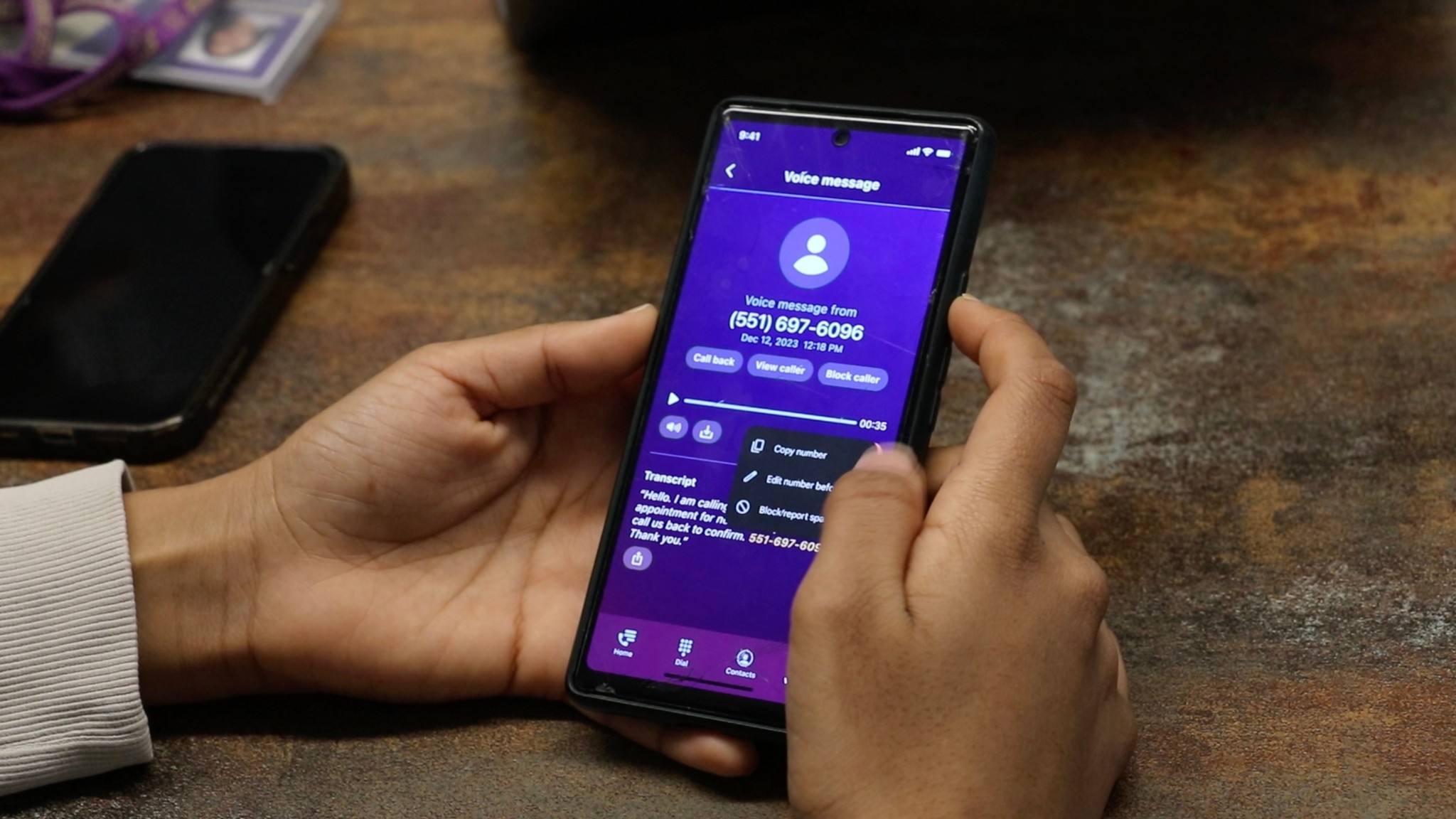
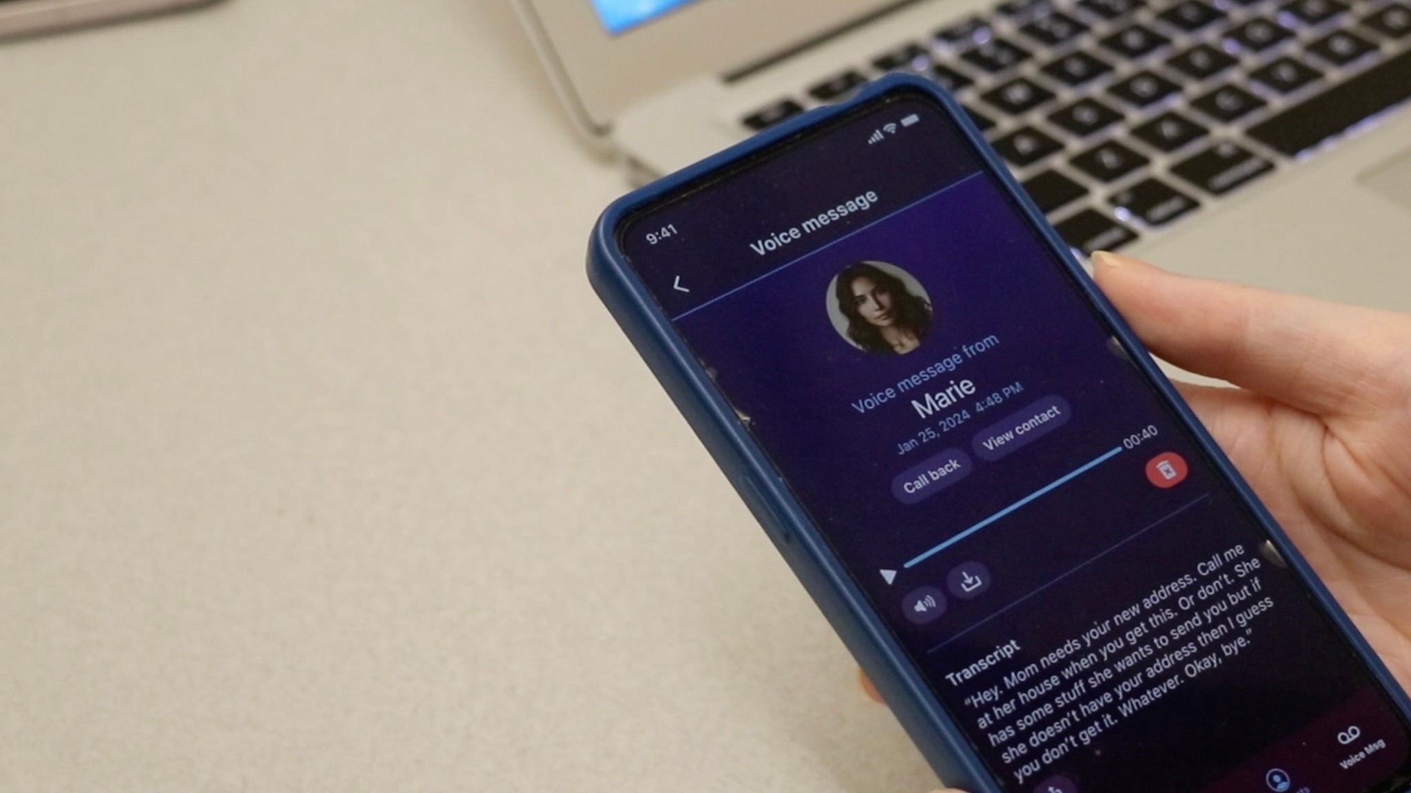
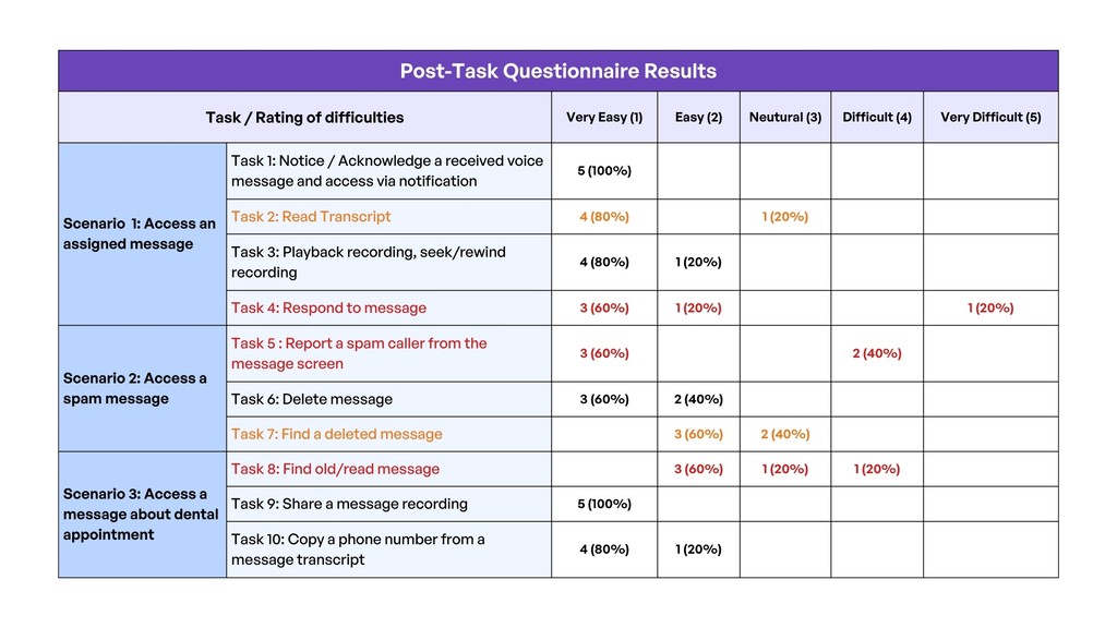
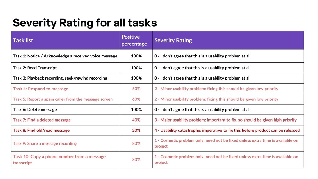
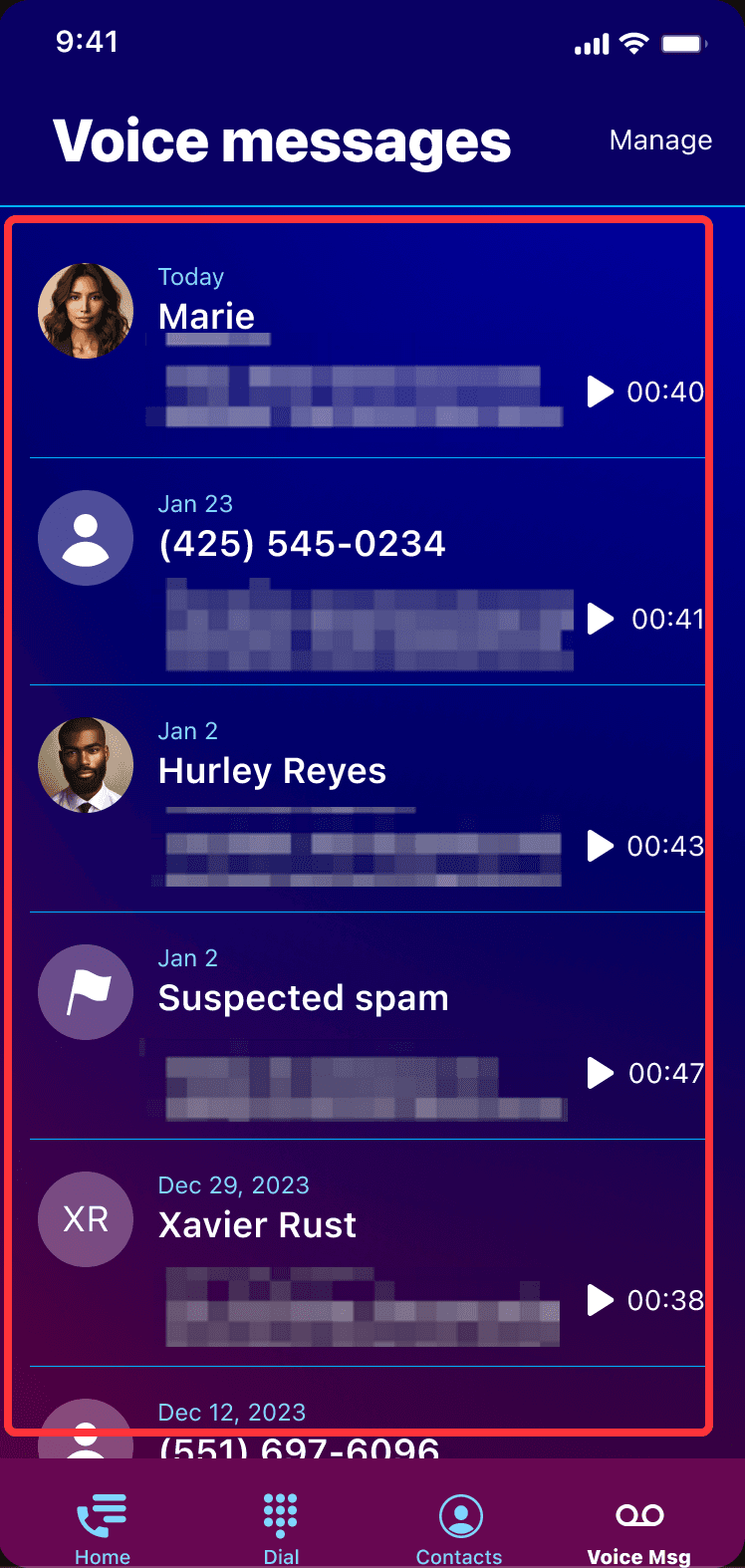
  1. Find and Access a received voice message

  2. Navigate to the transcript and read its content

  3. Playback recording, seek/rewind recording

  4. Respond to message

Real life scenario 2: Access a span
message

Real-life scenario 2: Access a span
message

  1. Report a spam caller from the message screen
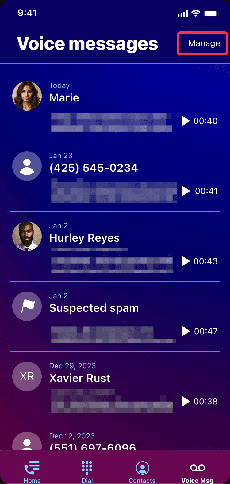
  2. Delete message

  3. Find a deleted message

Real life scenario 3:
Access a message about dental appointment

Real-life scenario 3:
Access a msg.
about dental appointment

  1. Find old/read message

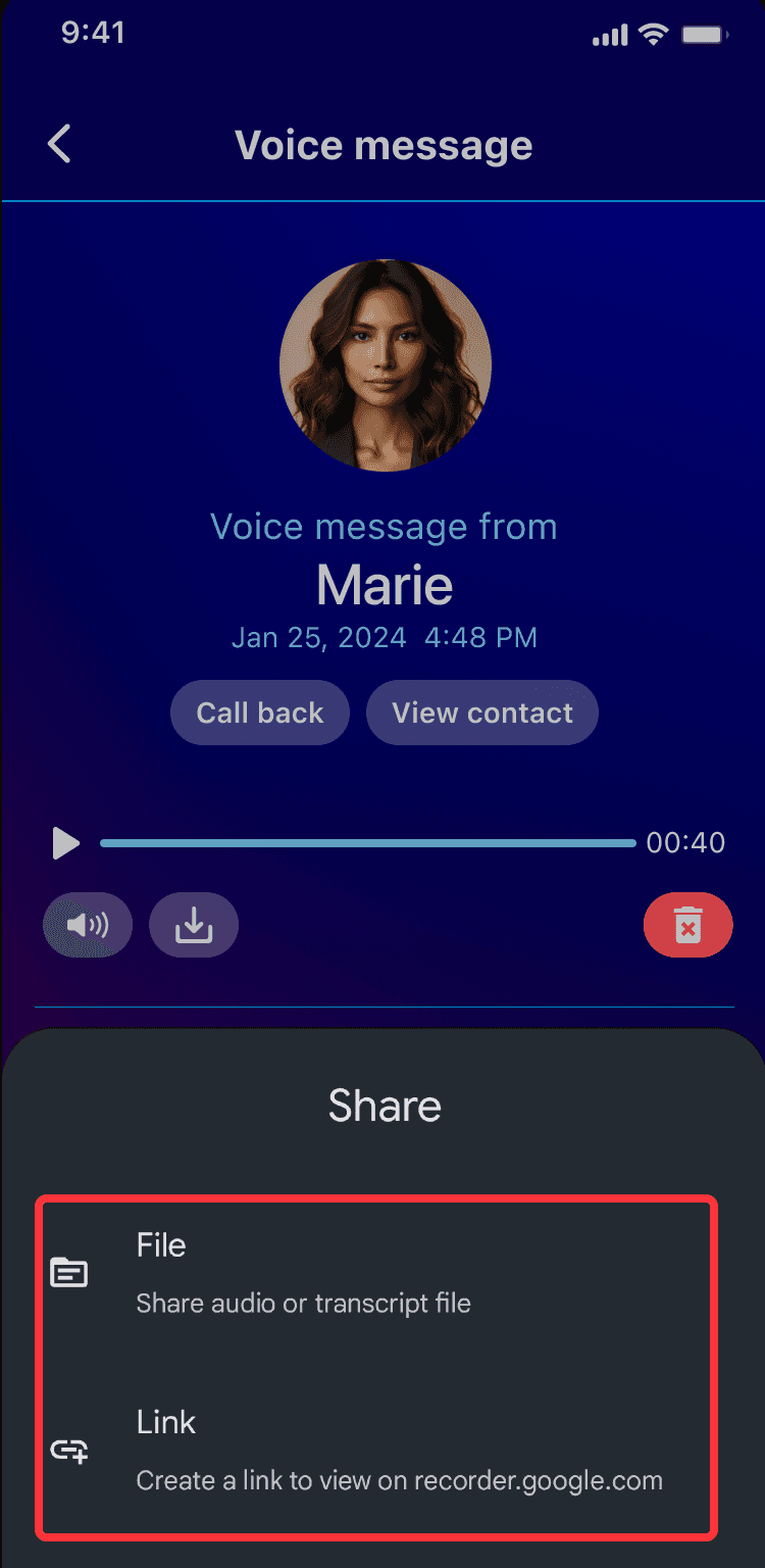
  2. Share a message recording

  3. Copy a phone number from a message transcript

Time-lapse of one of our interviews

link to the video

Images captured during testing

"I just want to search by name or date - this scrolling is painful."

Participant 4

Age 25

"Wait... where did my deleted voicemail go? I thought it would go to Trash."

Participant 2

Age 28

"So I can only call back? No text? That feels… incomplete."

Participant 5

Age 23

PHASE 3

PHASE 3

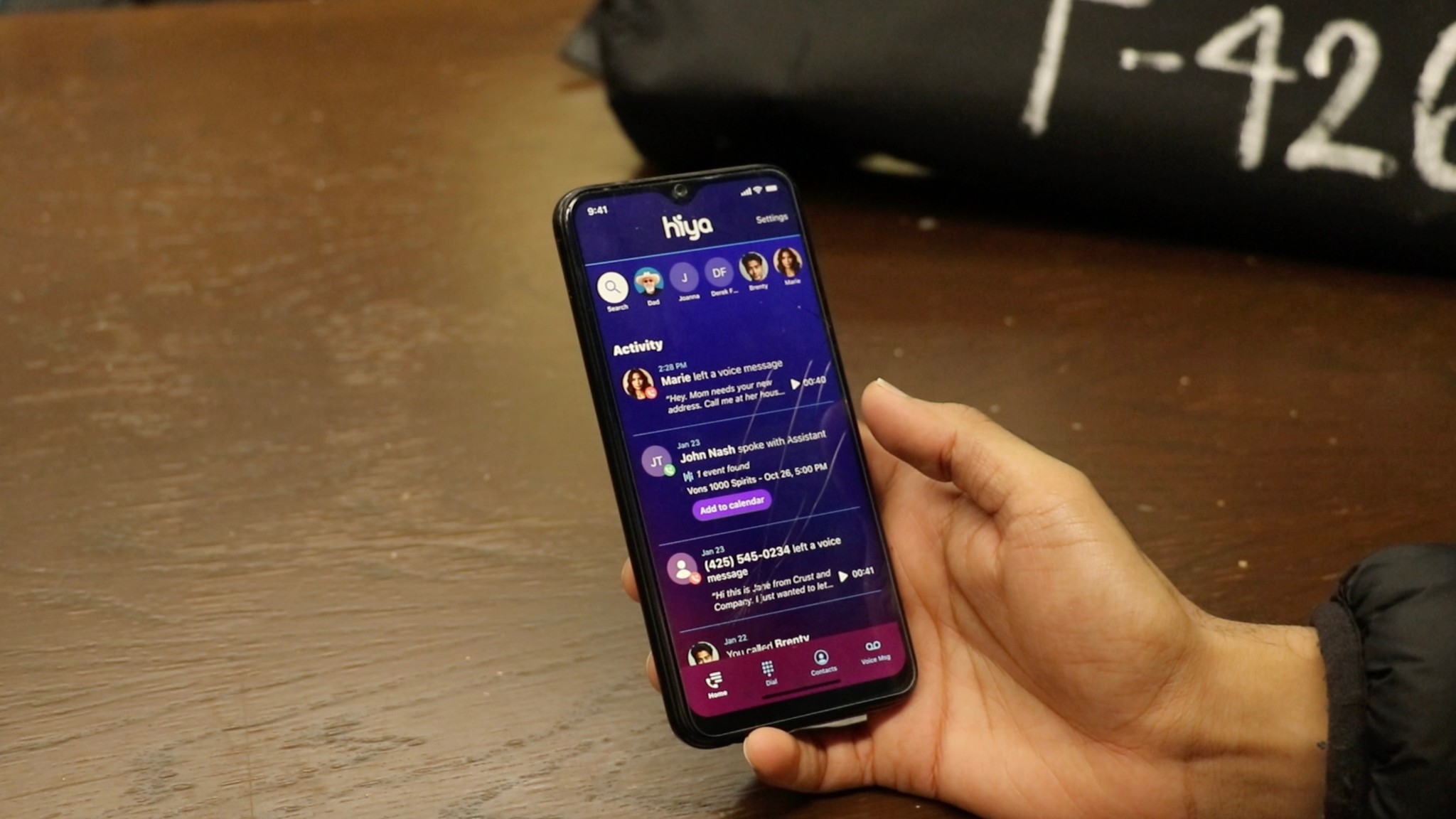
Data Analysis - What we found

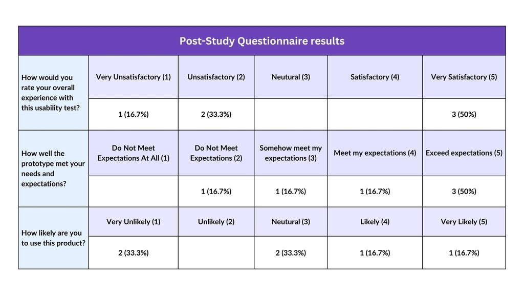
After running moderated usability tests, we analyzed 150+ qualitative and quantitative data points including user quotes, Likert ratings, think-aloud observations, and task metrics. We used affinity mapping to cluster key friction points and identify patterns.

Multi-Layered Analysis Process

  • Task by Task synthesis

  • Affinity Mapping + Notes

  • Post task and test analysis

  • Severity rating of all tasks

Multi-Layered Analysis Process

  • Task by Task synthesis

  • Affinity Mapping + Notes

  • Post task and test analysis

  • Severity rating of all tasks

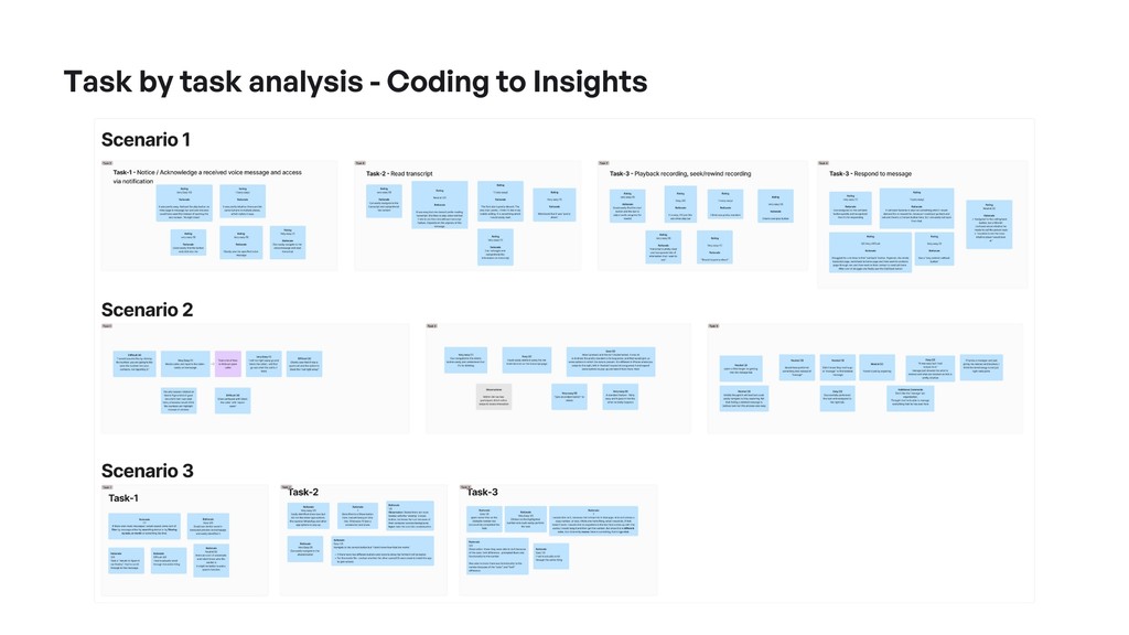
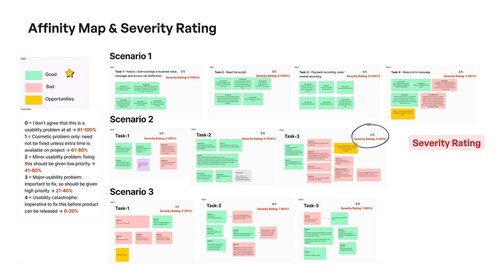
Emerged Patterns from testing

After analyzing user behaviors, pain points, and feedback from all 3 task scenarios, we clustered recurring usability issues into key patterns. These themes reflect where user expectations didn’t match system behavior- impacting navigation, comprehension, and response actions.

Retrieval
Barriers

Feature
Discoverability

Action
Limitations

Onboarding &
Navigation
Confusion

Understand findings in detail

Below, I will explain in detail what we found through the above phases and the impact of them.

No Way to Search or Filter Voicemails

Users had to scroll manually through unfiltered lists, leading to wasted time and frustration when managing message history.

4/6

users tried to find a search or filter option that didn’t exist

Slower

3x

than average task time to find the correct voicemail

“I just want to type a name or something this is too much scrolling.”

Sharing Options Were Confusing

Unclear choices like “Share as File” vs “Share as Link” made users hesitate - unsure which would actually send the voicemail.

80%

users failed to recover a voicemail they had just deleted

Slower

3x

users failed to recover a voicemail they had just deleted

“What’s the difference between this and that? Will it even send?”

Deleted Messages Were Hard to Find

Users couldn’t recover deleted voicemails because the “Manage” tab was vague and didn’t clearly indicate message recovery.

80%

users failed to recover a voicemail they had just deleted

Slower

3x

users failed to recover a voicemail they had just deleted

“I thought I’d lost it forever why is this under ‘Manage’?”

“Block” and “Report Spam” Did the Same Thing

Users thought these were different actions, but both triggered the same response, causing misunderstandings and reduced trust.

80%

of users expected different results from each button

Users

2

thought one was more reversible than the other

“Wait... did I just block them and report them? Or just one?”

Replying Meant Only “Calling Back”

Users expected more response options, but only “Call Back” was available, which felt limiting and outdated.

80%

users asked for options like “Text back” or “Send a voice reply”

Users

2

clicked around the screen trying to find more reply choices

“Why can’t I just send a text? I don’t want to call them back.”

Design Recommendations

Listed by ease of implementation + user impact. Together, these address 4 out of 5 key usability issues uncovered in testing.

  1. Rename “Manage” to “Deleted Messages”

Clarifies voicemail recovery path using familiar terminology (Gmail, iOS, etc.)

  1. Add Search & Filter Options

It helps users quickly find voicemails by contact name, date, or keyword.

  1. Differentiate “Block” and “Report Spam”

Split into two buttons with tooltips, it builds user trust and prevents misactions.

  1. Expand Reply Options (Text or Voice Reply)

Reduces dependency on call-back and better aligns with messaging habits.

  1. Clarify Sharing Options with Tooltips or Icons

Label “Share as Link” and “Share as File” with visual hints to reduce hesitation.

Stakeholders Collaboration and Outcome

We presented findings to the Product, Design, and Engineering teams at Hiya. Many of our recommendations were implemented in the latest release, directly improving user satisfaction and reducing recovery time by 60%.

Have any interesting projects in mind?

I am glad you want to connect with me and share your project. I usually respond within 2-3 days. Please reach out to me by email below or through other social accounts.

Have any interesting projects in mind?

I am glad you want to connect with me and share your project. I usually respond within 2-3 days. Please reach out to me by email below or through other social accounts.

Have any interesting projects in mind?

I am glad you want to connect with me and share your project. I usually respond within 2-3 days. Please reach out to me by email below or through other social accounts.